Mobile SEO India 2026: Why Google Ranks Mobile-First and What You Must Fix
Introduction
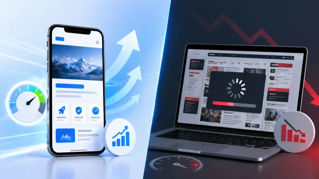
Over 78% of web traffic in India comes from smartphones. Not laptops. Not desktops. Phones. Yet most Indian business websites are still built desktop-first and then patched to work on smaller screens. Google noticed this gap years ago. In 2024, it completed the switch to mobile-first indexing for every website on the internet. That means Google now crawls and ranks your site based on what the mobile version looks like, not the desktop version most developers spend the most time on. If your mobile site is slow, hard to navigate, or missing content that exists on desktop, you are being ranked on an incomplete version of your site. This is one of the most common SEO mistakes Indian businesses make, and most do not realise it until traffic starts dropping.What mobile-first indexing actually means
Before 2019, Google’s crawler visited your desktop site and used that as the basis for ranking. The assumption was that desktop represented your “real” site. That assumption no longer holds. Googlebot now visits your mobile site first. Whatever it finds there becomes your ranking signal. Content that only exists on desktop does not get indexed. Scripts that slow down mobile load times hurt your position. Images sized for a 27-inch monitor served to a phone with a 6-inch screen count against you. If you open Google Search Console and see a Mobile Usability warning, you are already losing ground to competitors who have fixed this.Why this hits Indian websites harder than most
India has 750 million smartphone users. Mobile data got cheap after 2016 and has not gone back. Users expect pages to load on 4G in cities and on patchy 3G in smaller towns and rural areas. What that means practically: a 5-second load time on mobile loses most Indian users before the page finishes rendering. Users on budget Android phones with 2GB RAM process heavy JavaScript slowly. Regional language fonts in Hindi, Tamil, or Telugu add render weight if the site does not handle them efficiently. Businesses in Bhopal, Indore, Nagpur, and similar cities have not caught up to this yet. Most competitors in these markets still have mobile load times above 6 seconds. That is a gap worth closing now, before they do.Core Web Vitals: the three scores that determine your mobile ranking
Google uses Core Web Vitals as direct ranking signals. They measure real user experience on your mobile site, not how the site behaves in a lab.| Metric | What it measures | Target (Google) |
|---|---|---|
| LCP | Main content load time | Under 2.5 seconds |
| INP | Response time to taps/input | Under 200ms |
| CLS | Layout shifts while loading | Under 0.1 |
8 mobile SEO failures that are common on Indian sites
1. Desktop-only content
Content hidden behind “show more” toggles, tabs, or JavaScript accordions on mobile often does not get indexed. Google sees the mobile DOM. If your services section only expands on click, those descriptions may not exist as far as Google is concerned. Make all important content visible in the HTML by default on mobile, even if it is visually collapsed.2. Oversized images
JPEG and PNG images sized for desktop served to phones. A 2.5MB hero image that looks sharp on a monitor destroys mobile load time. WebP format reduces file size by 30 to 50% with no visible quality loss. Pair that with srcset so smaller screens get smaller files.3. Render-blocking JavaScript
Heavy scripts that block the browser from painting anything on screen. The browser downloads and runs JavaScript before the user sees a single pixel. Defer non-critical scripts. Move them to the bottom of the page. On content-heavy pages, consider whether a lighter approach would serve you better.4. Missing or broken viewport tag
This line belongs in every page’s head section: <meta name=”viewport” content=”width=device-width, initial-scale=1″> Without it, mobile browsers render a shrunken desktop view. Users have to pinch to zoom. Google flags this immediately.5. Tap targets too small
Google recommends minimum 48x48px tap targets with at least 8px spacing between them. Nav links crammed together, small call-to-action buttons, footer links in a column with no padding: these all generate Mobile Usability errors in Search Console.6. Text too small to read without zooming
Body text below 16px on mobile forces users to pinch-zoom. Test on an actual phone, not a browser emulator. Emulators do not replicate the rendering behaviour of budget Android hardware.7. Intrusive popups on page load
Full-screen newsletter overlays, app download banners, and cookie consent walls that cover the main content immediately on load. Google added a direct ranking penalty for these in 2017. It still applies. Use a sticky bar at the top or bottom of the screen instead, keeping it under 20% of screen height.8. Phone numbers not set up for click-to-call
Indian mobile users expect to tap a phone number and call directly. Wrap every number in a tel: link: <a href=”tel:+918989757497″>+91-8989-757497</a> This also improves local SEO signals for Google Maps.Where to start with mobile speed fixes
Run PageSpeed Insights on your site. The Opportunities section lists exactly what to fix. Work through them in this order:- Eliminate render-blocking resources — the single biggest LCP gain on most Indian sites
- Convert images to WebP and use srcset for responsive sizing
- Remove or defer unused JavaScript — audit what is loading on every page
- Enable Gzip or Brotli compression — your hosting provider should support this; confirm it is on
- Preload critical resources — your logo, hero image, and primary font should load before anything else
How to test your mobile SEO
Four free tools, each catching something different:- Google Search Console → Mobile Usability report → specific errors on your actual indexed pages
- PageSpeed Insights → pagespeed.web.dev → LCP, INP, CLS scores with fix guidance
- Google Mobile-Friendly Test → search.google.com/test/mobile-friendly → pass/fail with highlighted issues
- Chrome DevTools → F12 → Toggle device toolbar → simulate Redmi or Realme screen sizes and network speeds
Frequently Asked Questions
Does having a responsive design mean my mobile SEO is fine?
Responsive layout is necessary but not the whole picture. A responsive site still loads all desktop scripts and images on mobile. You also need speed optimisation and hands-on testing on actual Android hardware.
My site looks fine on my iPhone. Is that enough?
No. Most Indian users are on mid-range Android phones with slower chips and limited RAM. iPhone performance often hides problems that affect the majority of your actual audience. Test on a Redmi, Realme, or similar device.
How much does mobile optimisation actually affect rankings?
Core Web Vitals are a confirmed Google ranking factor. Google uses them as a tiebreaker between otherwise equivalent pages. The bigger effect is indirect: pages that load fast have lower bounce rates and longer session times, and both of those influence ranking.
Should I build a separate mobile site?
No. Google discourages separate mobile sites (m.dot format). They create duplicate content problems and double the maintenance work. Responsive design with mobile speed optimisation is the right approach.
Conclusion
India runs on mobile. Google ranks on mobile. If your website was built and tested primarily on a desktop, you are being evaluated on a version of your site that most of your users never see.
Run PageSpeed Insights on your homepage today. Check the Mobile Usability section in Search Console. The issues will be specific and fixable. Competitors in most Indian markets have not done this work yet, which means doing it now still makes a real difference.
If you want a full technical audit covering mobile SEO, Core Web Vitals, and schema implementation, get a free SEO audit and we will tell you exactly where your site stands.